SUMMARY
There are many disabilities around the colors such as color blindness, low vision. In such cases, many users cannot identify the colors at all. So, any information getting presented by the color only, then it would be missed by them. One of the most common disabilities is where a person is not able to differentiate between red and green colors.
Eg. Red and green are the most common colors used by the designers to represent error and success.
Eg. if you are showing error stages only by red color and not using the text to inform the users then this is the wrong approach and non-accessible.
Another issue with the colors is readability. If the background color, font-color contrast, and,font-size is not proper then it would be hard to read by the folks.
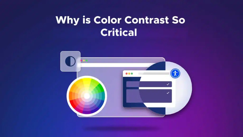
WCAG has guidelines around this to help developers and designers to understand the correct contrast ratio between background-color, font-color, and font-size as per the level of accessibility – AA or AAA

IMPACT:
- Many users are colorblind or have low vision
- Contrast impacts those with low vision, while those who are colorblind cannot distinguish between certain colors
- Color choice matters for both groups of users
WCAG CHECKLIST FOR COLOR CONTRAST
- Color and/or placement is not used as the sole means of conveying information on the page
☐ Yes ☐ No
Examples:
- All Red Fields are Required
- Click on the leftmost button
- Hover state has sufficient contrast or underline
☐ Yes ☐ No - Captions have sufficient contrast
☐ Yes ☐ No - For normal/small text (12 point or smaller), the color contrast to maintain is 4.5:1 [AA criteria]
☐ Yes ☐ No - For normal/small text (12 point bold or smaller), the color contrast to maintain is 4.5:1 [AA criteria]
☐ Yes ☐ No - For normal/small text (12 point or smaller), the color contrast to maintain is 7:1 [AAA criteria]
☐ Yes ☐ No - For large text (14 point or bigger), the color contrast to maintain is 3:1 [AA criteria]
☐ Yes ☐ No - For large text (14 point bold or bigger), the color contrast to maintain is 3:1 [AA criteria]
☐ Yes ☐ No - For large text (14 point bold or bigger), the color contrast to maintain is 4.5:1 [AAA criteria]
☐ Yes ☐ No - For graphics, the color contrast to maintain is 3:1 [AA criteria]
☐ Yes ☐ No
Color Contrast Example
- I have poor color contrast
- I have better color contrast but do not meet WCAG standards
- I have adequate color contrast
Color Contrast Analyzer Tool
- https://chromewebstore.google.com/detail/color-contrast-analyzer/dagdlcijhfbmgkjokkjicnnfimlebcll?hl=en&pli=1
- Axe chrome plugin
- Color Contrast Analyzer Windows application https://www.tpgi.com/color-contrast-checker/
- To check color blind filter tests, https://www.toptal.com/designers/colorfilter
- To check color contrast ratio, https://coolors.co/contrast-checker/4a6580-acc8e5
- To check color contrast ratio, https://webaim.org/resources/contrastchecker/
- Accessibility Developer tools chrome plugin
USABILITY
Many users have a non-apparent disability, such as a traumatic brain injury or a cognitive or learning disability, that affects their ability to process information. Clear organization of information is vital for these users.
CLEAR AND SIMPLE CONTENT
- Fonts are basic, legible, easy to read
☐ Yes ☐ No - The viewing area is not crowded or chaotic
☐ Yes ☐ No - There is plenty of white space
☐ Yes ☐ No - There is no flashing content, blinking or moving text
☐ Yes ☐ No
CONSISTENCY AND LOGIC IN VISUAL NAVIGATION
- Menus are consistent across the entire product
☐ Yes ☐ No - Visual navigation is logical
☐ Yes ☐ No
TESTING NON-AUDIO ACCESS
This includes audio files such as podcasts as well as videos.
- ☐ N/A (There is no audio or video content)
- Users have control over whether or not to start playing the video or audio
☐ Yes ☐ No - All videos have captions
☐ Yes ☐ No - Existing captions are accurate
☐ Yes ☐ No - Captions have sufficient contrast
☐ Yes ☐ No - All audio files have a link to a transcript
☐ Yes ☐ No
STEM (SCIENCE, TECHNOLOGY, ENGINEERING AND MATHEMATICS) CONTENT
This includes math or other content that uses special symbols:
- ☐ N/A (There is no content with math or other symbols.)
- Screen reader recognizes and reads the math or other content special symbols (formatted using MathML, MathJax, LaTeX)
☐ Yes ☐ No
DOWNLOADABLE FILES
Documents that are linked for download from a site also need to be accessible.
- ☐ N/A (There are no downloadable files)
- PDFs are searchable / OCR’d (you can highlight or search text in the document)
☐Yes ☐No ☐ N/A - PDFs have tags and the reading order is logical
☐Yes ☐No ☐ N/A - PDFs have alt text for non-text elements
☐Yes ☐No ☐ N/A - Word documents have hierarchical headings
☐Yes ☐No ☐ N/A - Word documents have alt text on non-text elements
☐Yes ☐No ☐ N/A - PowerPoint slides have logical reading order
☐Yes ☐No ☐ N/A - PPT slides have alt text on non-text elements
☐Yes ☐No ☐ N/A - PPT slides have sufficient contrast
☐Yes ☐No ☐ N/A